Who Designed The Nike Swoosh?

Without a shadow of a doubt, the Nike Swoosh is some of the most recognisable branding in history. Sitting alongside McDonald’s Golden Arches and Apple’s part-eaten fruit, according to a survey by promotional merchandise distributor 4imprint, it’s also the most iconic logo of all time.
But who is it that actually designed the Nike Swoosh? If you’ve ever found yourself pondering the origins of the tick emblem, then you’ll want to keep on reading down below. In this guide, we’re going dive into everything that you need to know. So, let’s get to it!

Who Designed The Nike Swoosh?
The original designer of the Swoosh was Carolyn Davidson, who drew up the logo in 1971. At the time, she was attending Portland State University as a graphic designer. This is where she came to know Phil Knight who was then an accounting professor at the school.
Knight asked Davidson to come up with a simple logo that could be adorned on the side of Nike sneakers. This led her to create the iconic logo that we all know and love. What makes things even more interesting, however, is that Davidson was paid just $35 for her work on the logo!
While this might not sound like a lot, it’s worth remembering that this was in the very early days of the company, and they didn’t really have that much money to spend. Davidson was later given a large amount of stock. She’s also considered to be one of the most esteemed graphic designers of all-time.
How Much Is The Nike Swoosh Worth?
The Nike Swoosh has gone on to become one of the most valuable logos in the world. While Knight spent just a measly $35 on it, it’s now worth an estimated $26 billion. Yes, that’s billion with a “b.”
What Does The Nike Swoosh Symbolise?
The Nike logo, with its smooth and sleek lines and curves, is actually made to symbolise one of the wings of the goddess Nike, who, according to Greek mythology, sat beside Zeus in Olympus.
Nike was the Greek goddess of victory, and she used her wings to fly around and reward soldiers with fame and glory after a triumph. This message was particularly important for a sportswear company that focused on creating some of the best running shoes out there.
Has The Nike Swoosh Changed Much Over The Years?
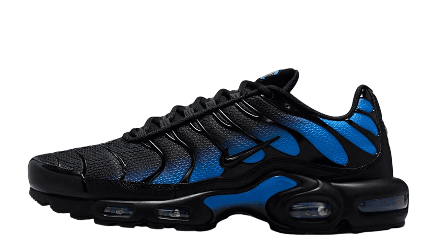
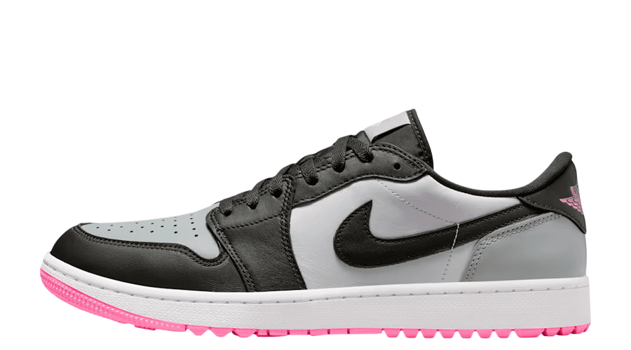
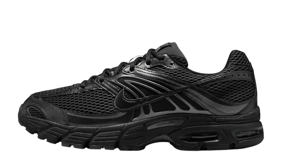
Though Nike has largely kept the iconic Swoosh totally untouched, the logo has changed slightly over the years. The first variation actually incorporated the “Nike” name in the design of the logo, written directly on top of the tick itself. As the years went on, and the Beaverton brand gained more and more attention, the logo actually became more simplified.
In 1978, the “Nike” text changed to the Futura font that’s used today, written in the same white colour as the Nike Swoosh, to create a modern and clean looking design. The current iteration capitalises on the recognisable nature of the logo, and simply has it stand alone without the need for any other elements, or even the name of the company.
Why Is The Nike Swoosh So Effective?
One of the main reasons why the Nike Swoosh logo is so effective is because of its sheer simplicity. There is very little to the logo, and it is made of a very simple curved shape. This makes it easy for anyone to memorise it and then recognise it when they see it again.
The Swoosh is also representative of the values of the American company. Nike specialises in creating sporting equipment, such as trainers, that can help to make the wearer faster, or able to more easily endure sporting activities. The Swoosh is a smooth shape that is easy for the eyes to follow quickly. Its fluid look is reflective of the speed that the company specialises in. It’s also commonly paired with the iconic tagline: “Just Do It.”
The Bottom Line
And, there you have it! The Nike Swoosh logo is easily one of the most recognisable logos in the world. Though the brand may have had very humble origins, as a sketch by a young graphic design student, it has gone on to be a perfect representative of the values of the company, and a highly beloved and trusted symbol in its own right.


