The 15 Best Football Kits to Cop Before World Cup 2026 Kicks Off
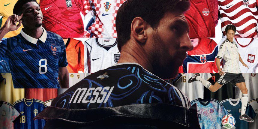
In case you haven’t noticed, the 2026 FIFA World Cup is coming in hot. In just a few weeks’ time, some of the world’s greatest football teams will be landing in North America to battle it out across the US, Canada, and Mexico. And while everyone else is busy arguing over who’s winning the Golden Boot or whether football’s actually coming home this time, we’re looking at something equally important: the kits.
Because football shirts have fully escaped the stadium now. You’ll spot them everywhere – at the pub, at festivals, layered under blazers, thrown on with jorts and Sambas, or worn with beat-up jeans like it’s 2003 all over again. Some lean into nostalgia. Others go full futuristic with weird graphics and bold sponsor placements. Either way, there’s never been a better time to buy one. So whether you actually know what a low block is or you just want something that looks sick with cargos, these are the best football kits to get right now.
Argentina Home (adidas)

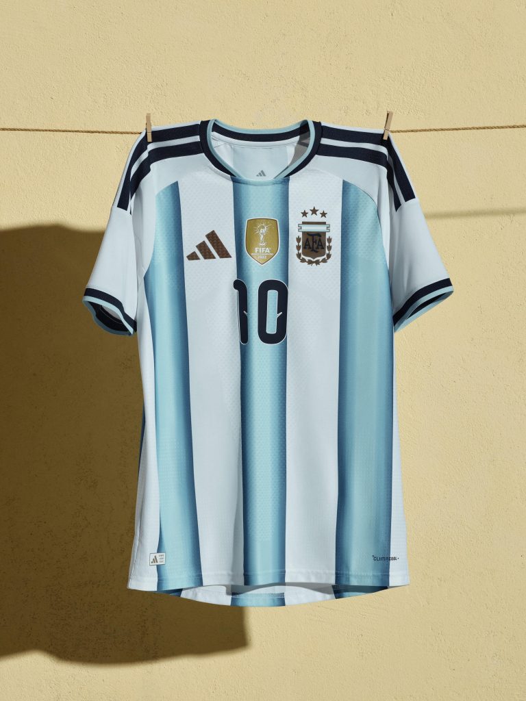
You don’t really mess with perfection, and thankfully adidas knows that. Argentina’s home shirt keeps the iconic Albiceleste stripes exactly where they should be, but this time they’ve added a subtle gradient fade through the blue panels that makes it feel just a little more modern. It’s clean, confident, and looks even better with the three stars sitting above the crest. World champion kits can sometimes go overboard trying to flex the achievement, but this one keeps things classy. Lionel Messi lifting another World Cup trophy in this would almost feel too scripted.
Japan Away (adidas)
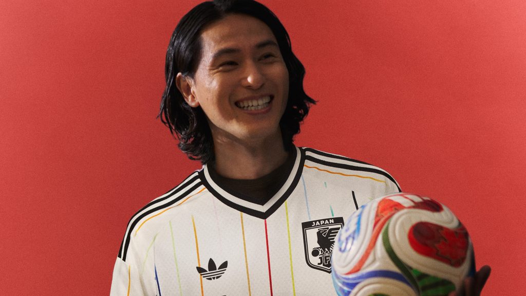
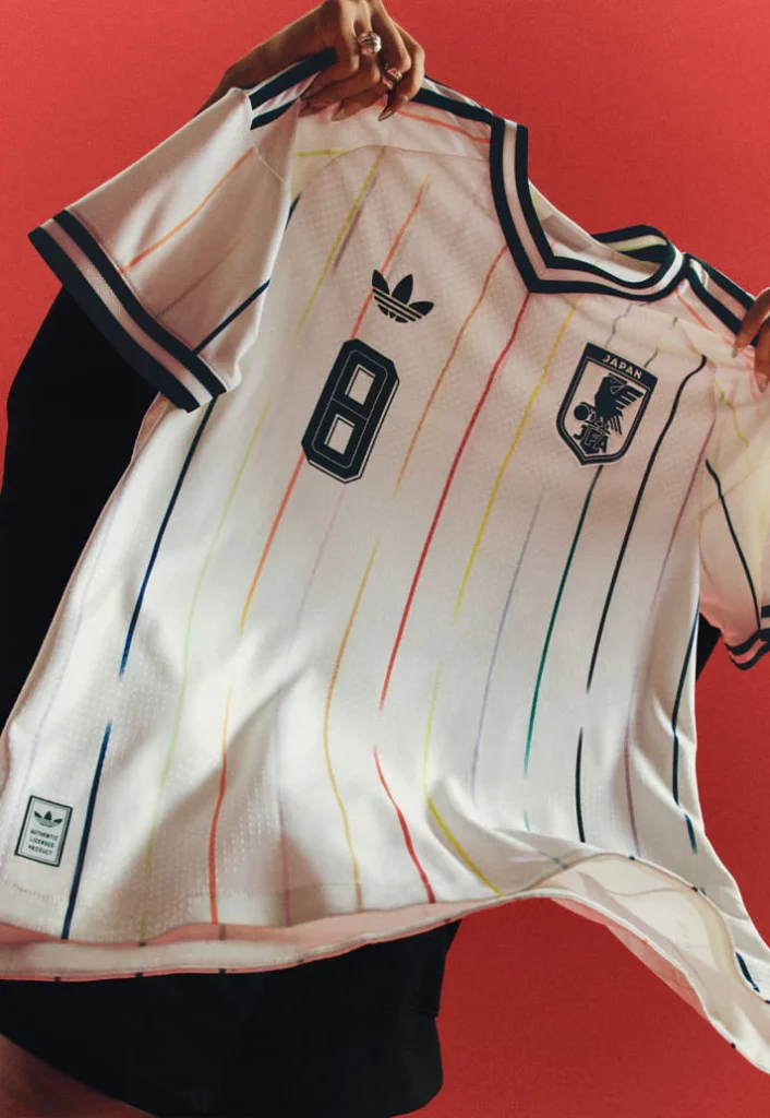
Japan simply doesn’t miss when it comes to football kits. This year’s away shirt goes full lifestyle mode with an off-white base and contrast black detailing. It also features 12 vibrant accents, each one paying tribute to the players, anchored by a central red stripe that represents the Japanese football family. Honestly, this barely even feels like sportswear anymore. It’s the sorta jersey that looks just as good with wide-leg jeans and loafers as it does with shorts on five-a-side night.
Brazil Home (Nike)
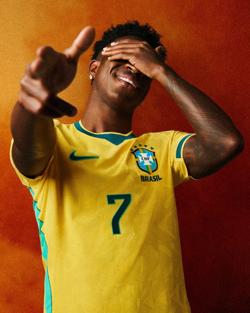
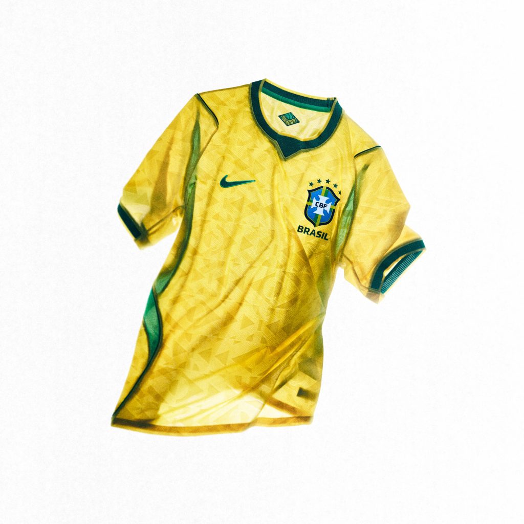
Some football shirts are bigger than football itself, and Brazil’s yellow jersey is one of ’em. Nike‘s kept things pretty traditional here, to the point that even if you didn’t peep the “Confederação Brasileira de Futebol” badge on the chest, you’d know this was the Brazil kit straight away. It doesn’t try too hard, and that’s exactly why it works. Bright yellow, green trim, beautiful football. Leave the rest alone.
Belgium Away (adidas)
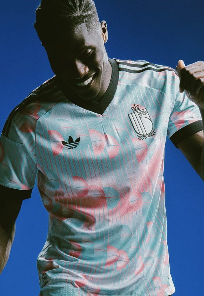
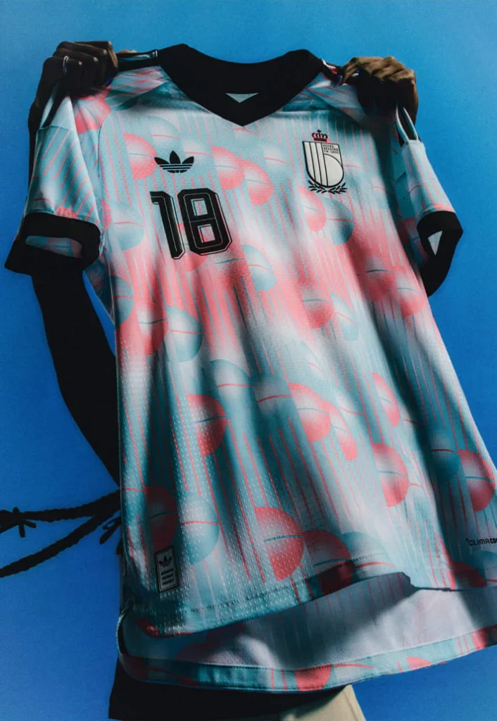
Belgium could’ve easily played it safe. Instead, adidas went properly weird with this surrealist-inspired away kit, and thankfully it paid off. The blue and pink colour combo feels slightly futuristic, while the abstract graphics give it that collectible energy that football shirt nerds go crazy for. It’s less “World Cup football kit” and more “limited capsule drop.”
Germany Away (adidas)

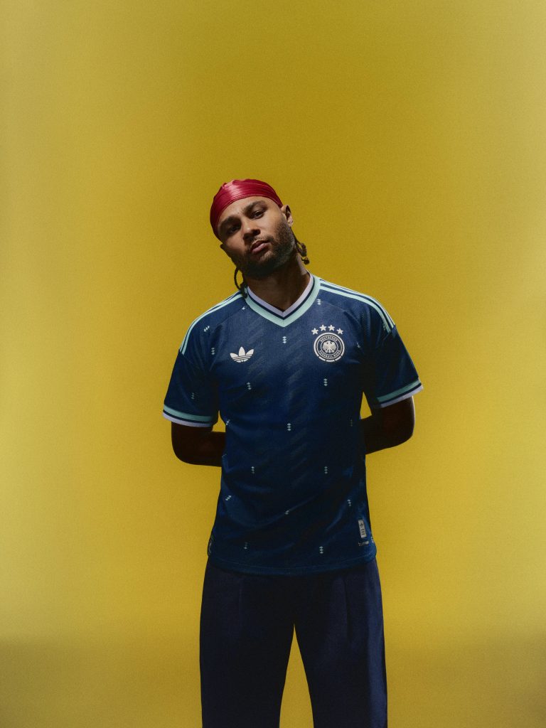
Drenched in deep navy with sharp chevron graphics running through it all, Germany’s shirt is the sorta kit that looks intimidating before a ball’s even been kicked. adidas has been on a ridiculous run lately when it comes to away shirts, and this might be one of its strongest efforts yet. You can already picture this paired with black cargos and silver jewellery somewhere on TikTok.
England Home (Nike)
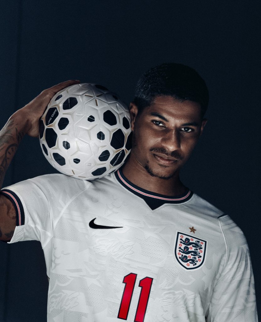
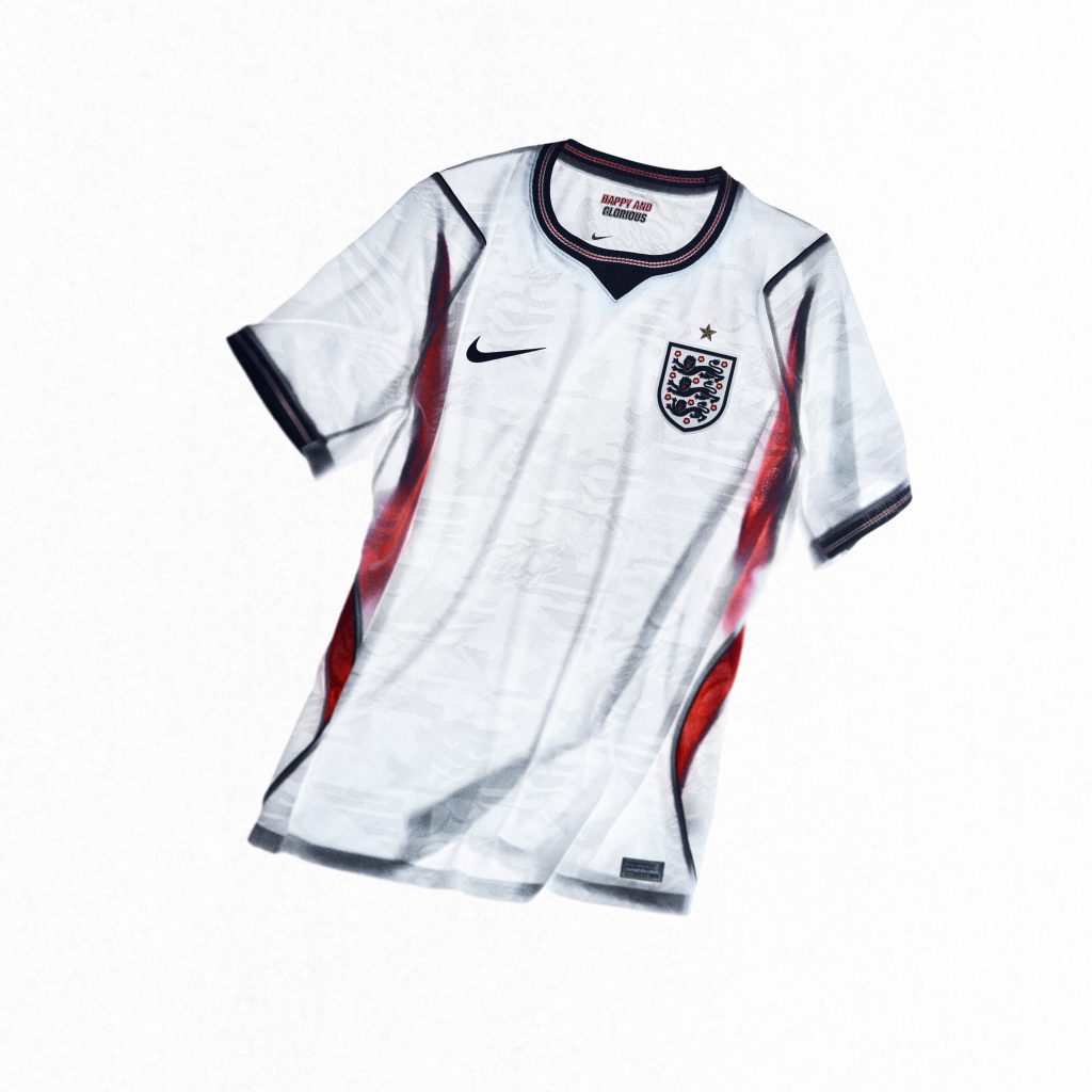
England kits always walk a very fine line. Go too basic and everyone gets bored. Go too experimental and people start acting like the world’s ended. Nike’s found the sweet spot here. At first glance it’s a classic white England shirt, but the closer you look, the more details start revealing themselves – textured knit patterns, subtle blue accents, and a metallic gold star sitting quietly above the crest. Even the “Happy and Glorious” text inside the collar feels surprisingly tasteful.
Uruguay Away (Nike)
Uruguay’s away kit for the World Cup is basically what happens when minimalism goes athletic. The deep obsidian blue paired with electric blue tones makes everything feel faster somehow. It’s sleek, sharp, and has that slightly underrated energy that Uruguay kits always seem to carry. No over-the-top graphics. No loud gimmicks. Just a very, very solid football shirt.
Curaçao Away (adidas)
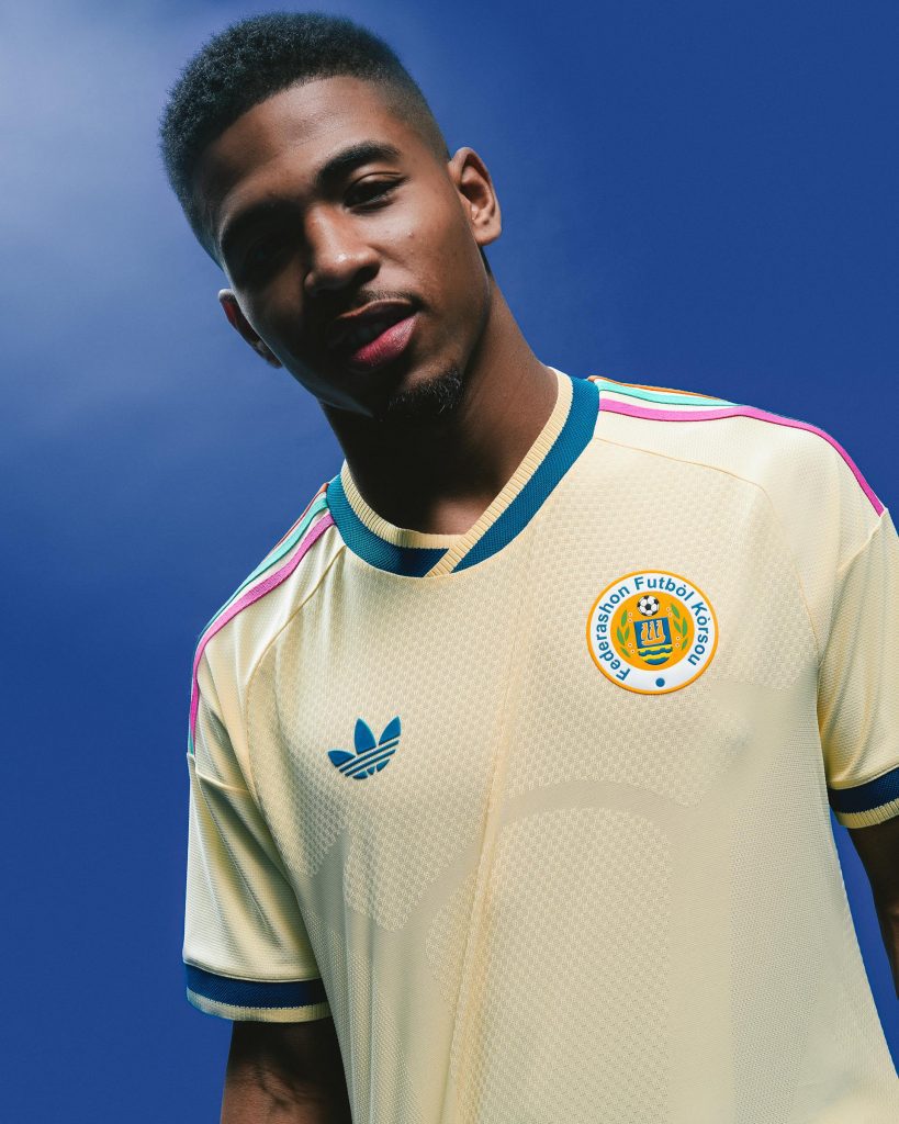
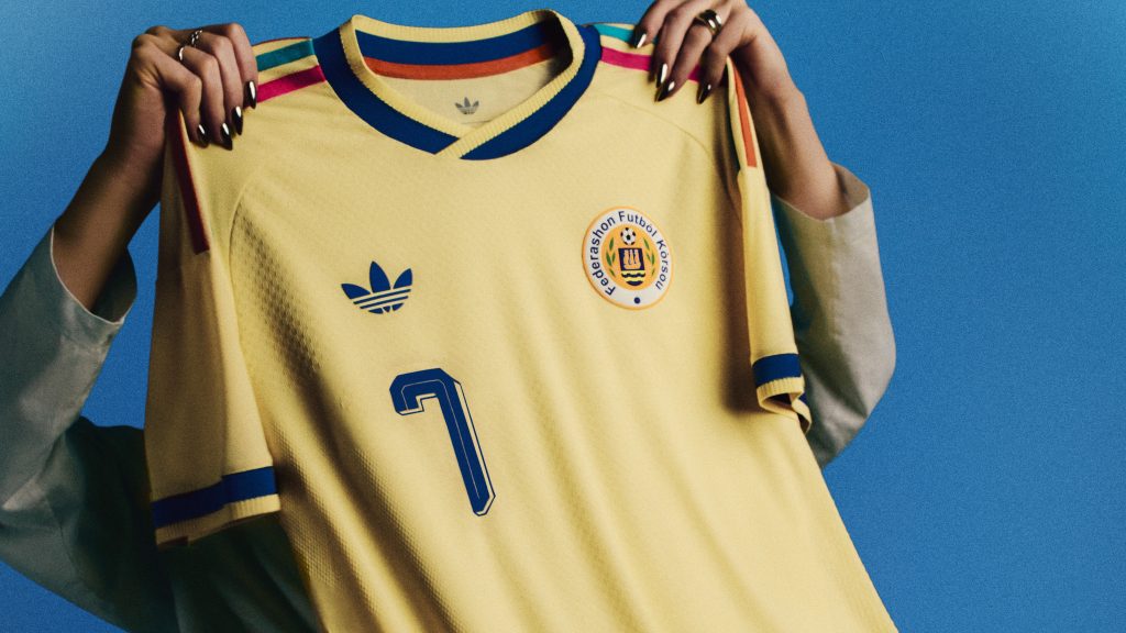
This is, without a doubt, one of the most fun kits at the World Cup. Curaçao’s away shirt takes inspo from the island’s colourful colonial architecture, translating it into geometric patterns splashed across a soft yellow base. It’s loud in the right way. The kinda jersey that instantly catches your eye scrolling through Insta. Football kits are supposed to represent where you’re from, and this one absolutely nails that brief.
Argentina Away (adidas)
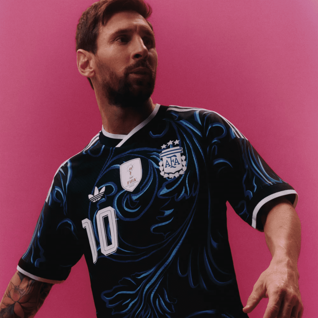
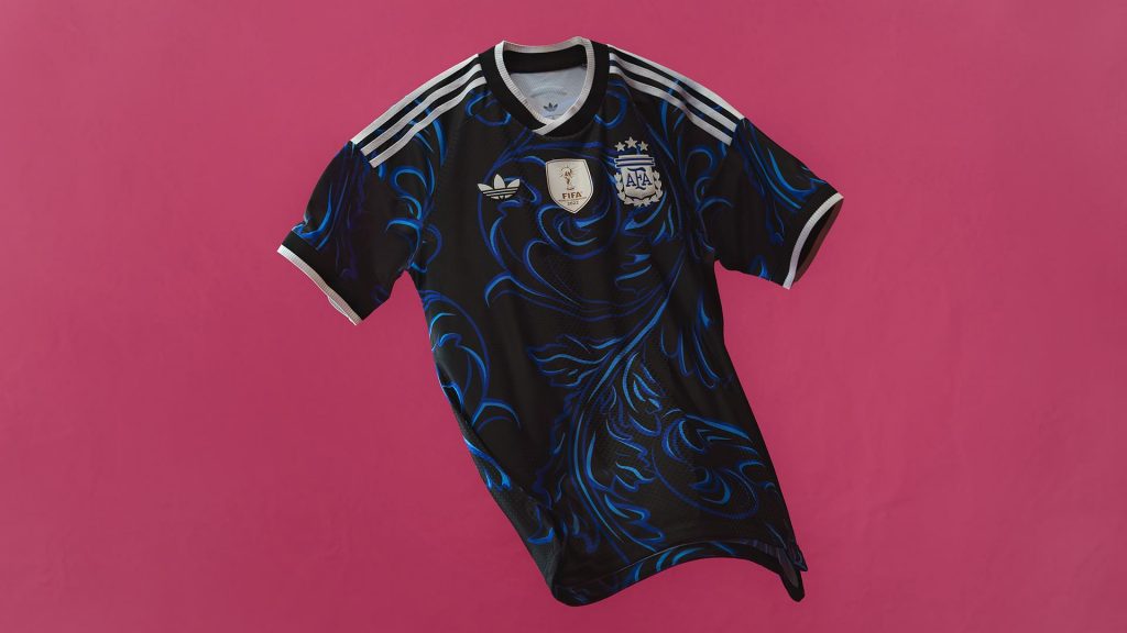
While the home shirt lean on the more traditional side of things, Argentina’s away kit goes in the complete opposite direction. The black base is covered in swirling blue graphics inspired by traditional Fileteado artwork, giving it a slightly more artistic feel than most international kits out there right now. It’s slick, slightly dressier, and definitely the sort of shirt that’ll disappear from stock immediately once Messi scores in it.
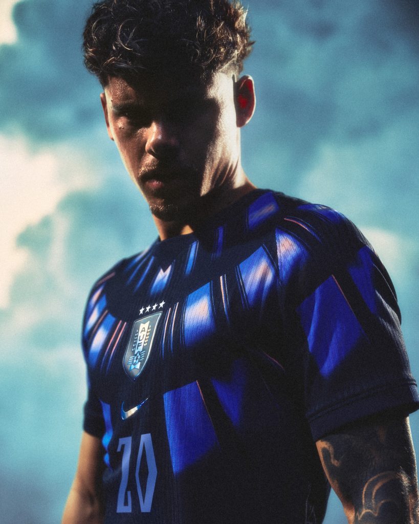
South Korea Home (Nike)
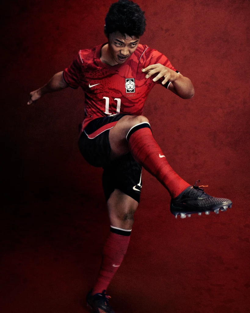
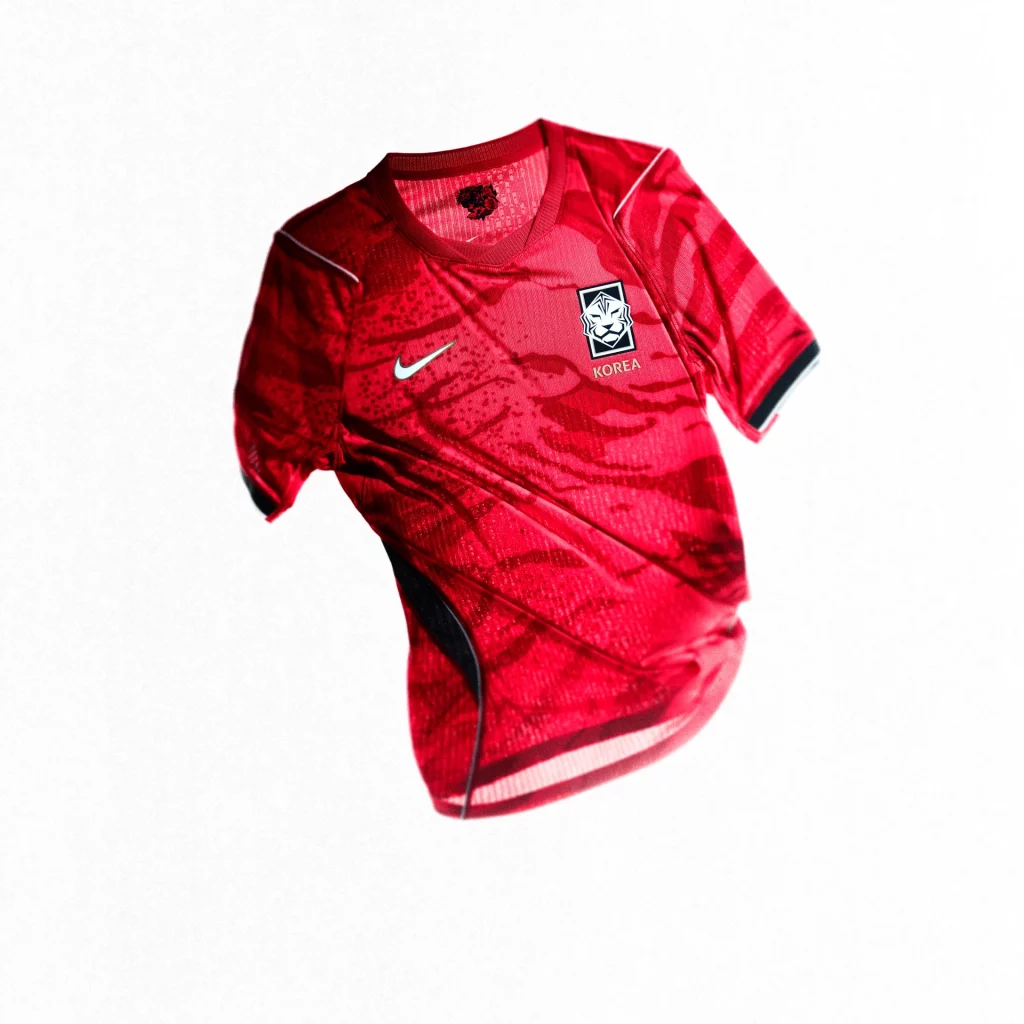
South Korea’s home shirt has serious energy to it. The fiery red base is layered with a tiger stripe-inspired camo pattern woven through the fabric, referencing the white tiger – a long-standing symbol in Korean culture. It’s aggressive, bold, and feels built for fast football. Nike could’ve easily toned this down, but thankfully they didn’t.
Mexico Home (adidas)
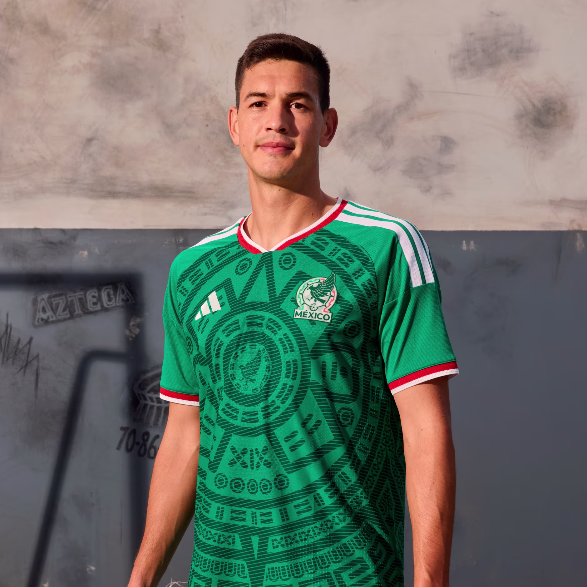
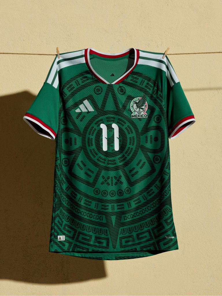
Every World Cup cycle there’s always one Mexico kit that completely takes over the group chat, and this is probably the one for 2026. The deep green base is packed with Aztec and Mayan-inspired detailing that actually feels considered rather than just randomly decorative. adidas has managed to make this feel historical and modern at the same time, which is a very difficult thing to get right. Genuinely one of the best shirts at the tournament. In fact, actor Pedro Pascal actually wore it to CCXP earlier this year.
France Home (Nike)
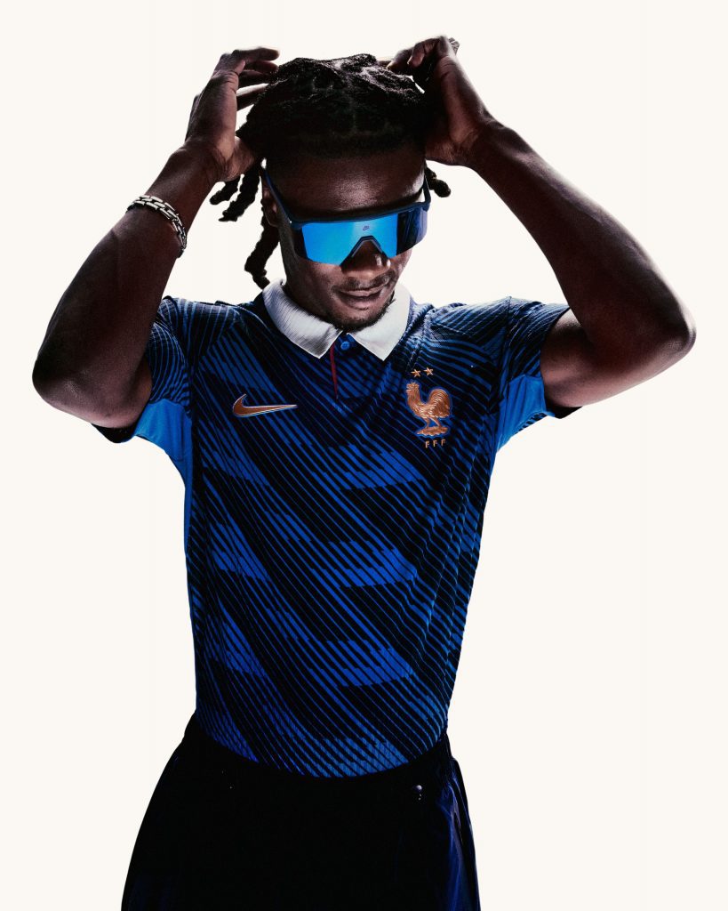
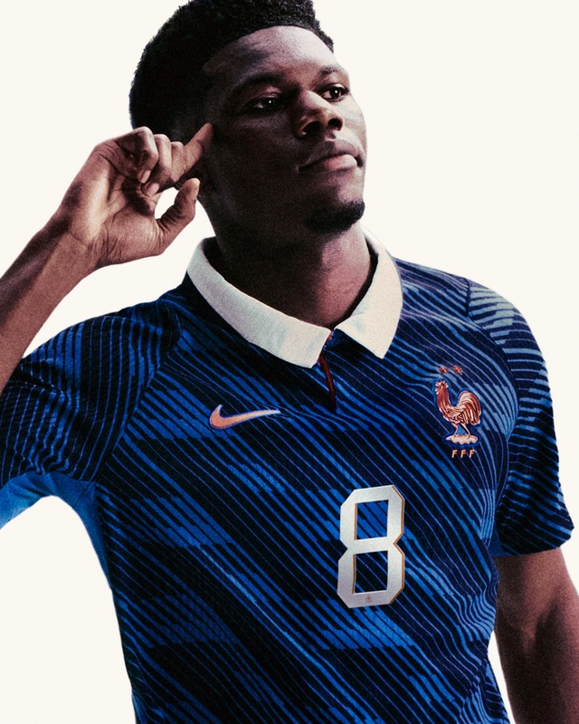
France doesn’t really do loud football shirts. And you know what? They don’t need to. This midnight blue jersey keeps things extremely simple with a clean silhouette and a contrasting white collar that gives it just enough personality. There’s something very expensive-looking about it all. Like the football shirt equivalent of a navy wool coat or a black pair of Saint Laurent boots.
Spain Home (adidas)

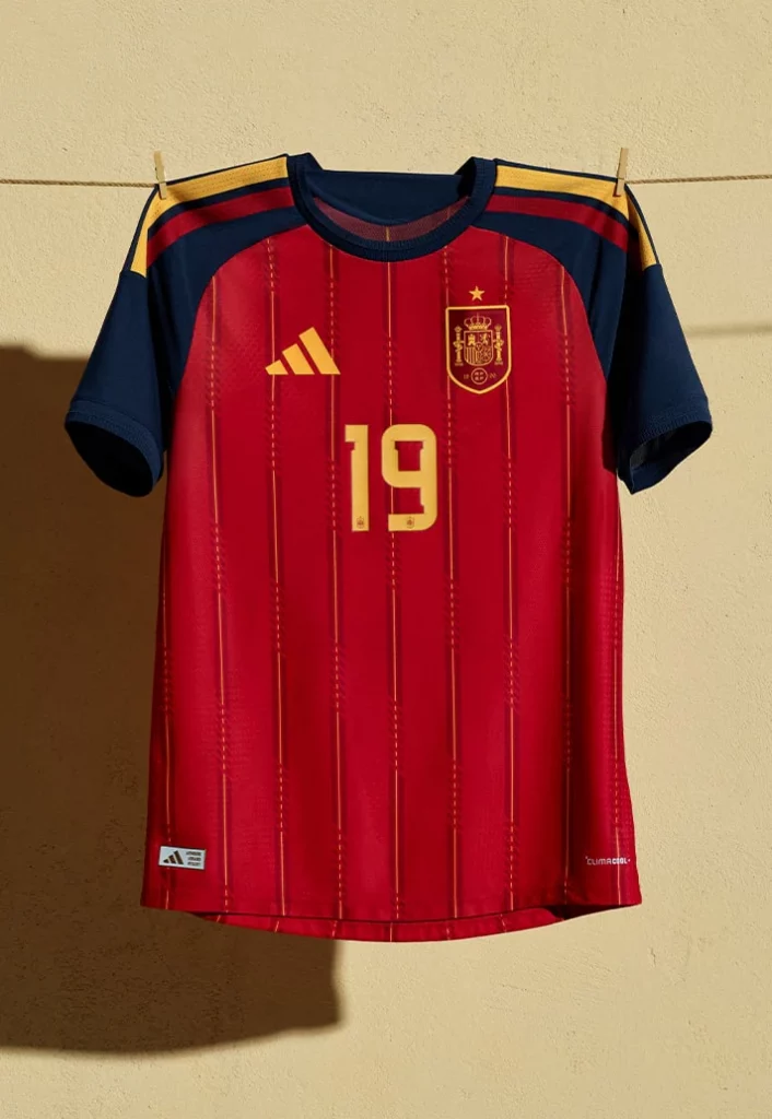
Spain’s latest home shirt strips everything right back in the best way possible. Bright red, subtle gold hues, simplified crest – done. No unnecessary graphics flying around. No chaotic gradients. Just a bold, confident colour palette that fully leans into the whole La Roja identity. Sometimes the simplest World Cup kits end up ageing the best, and this feels like one of those.
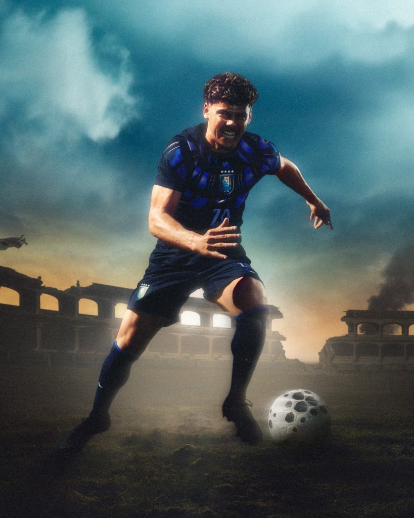
Italy Home (adidas)
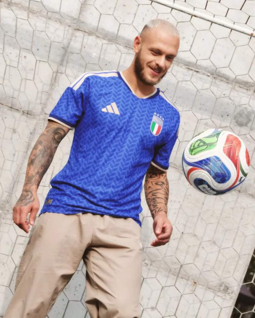
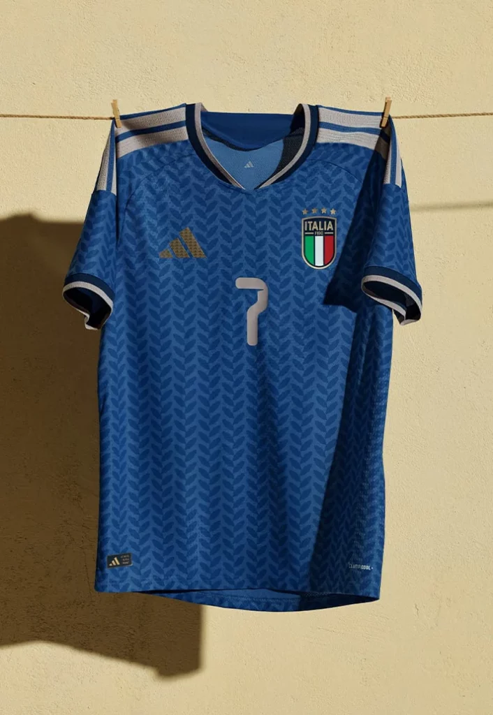
Italy and good-looking football kits just go hand in hand at this point. This year’s Azzurri shirt comes with a laurel leaf pattern running through the famous blue base – a nod to laurel crowns, which were traditionally worn by emperors, athletes, and generals in the Roman Empire to signify triumph and glory. It feels premium. Like something you’d expect from a luxury fashion house rather than a sportswear brand. Which, to be fair, is very Italy.
USA Home (Nike)

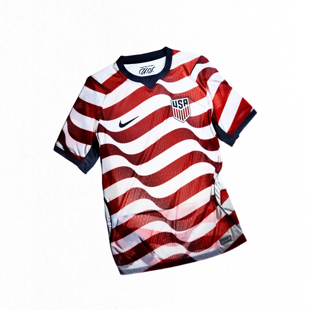
And last but not least, we have to give USA’s home shirt a special shoutout. As one of the host nations, Nike put massive effort into this design. As you might expect, it’s decked out in a very patriotic red, white, and blue colour combo. The front is covered in a wavy design that nods to the American flag. It’s definitely not as wearable as the others in this list, but if you’re into your stars and stripes, this is the one.